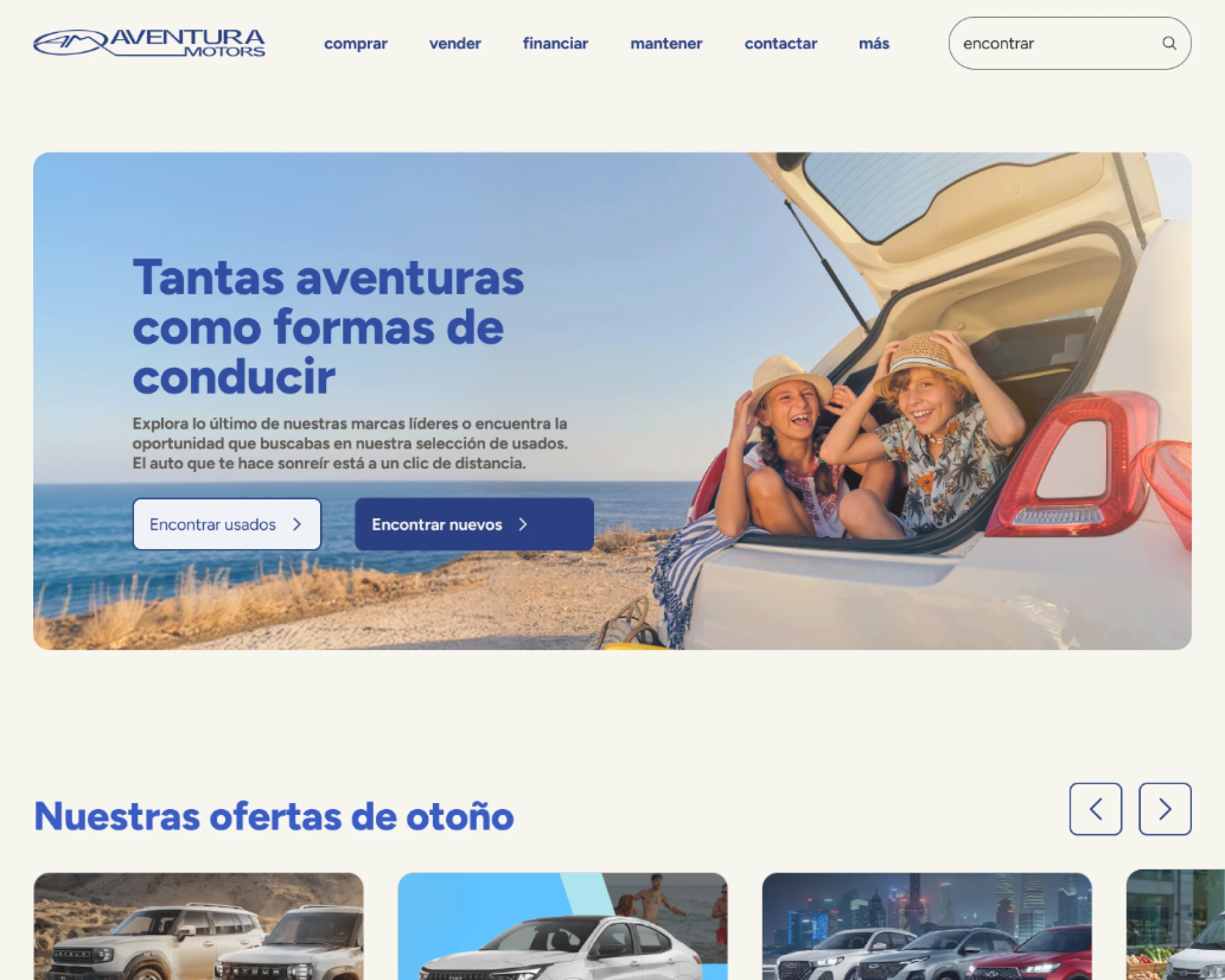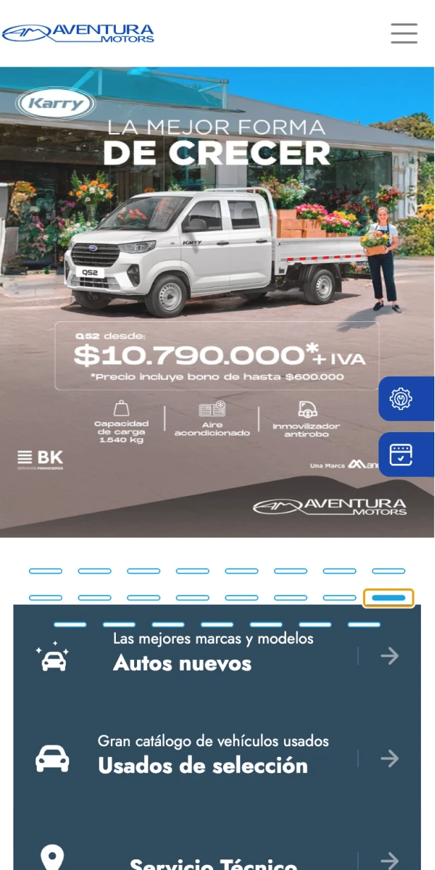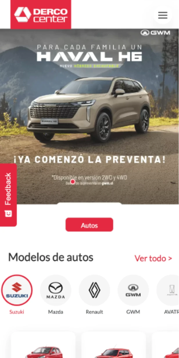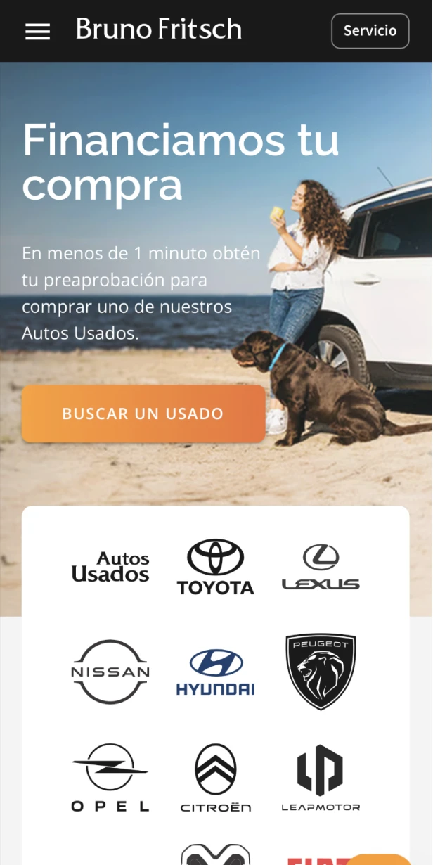
A Real Problem

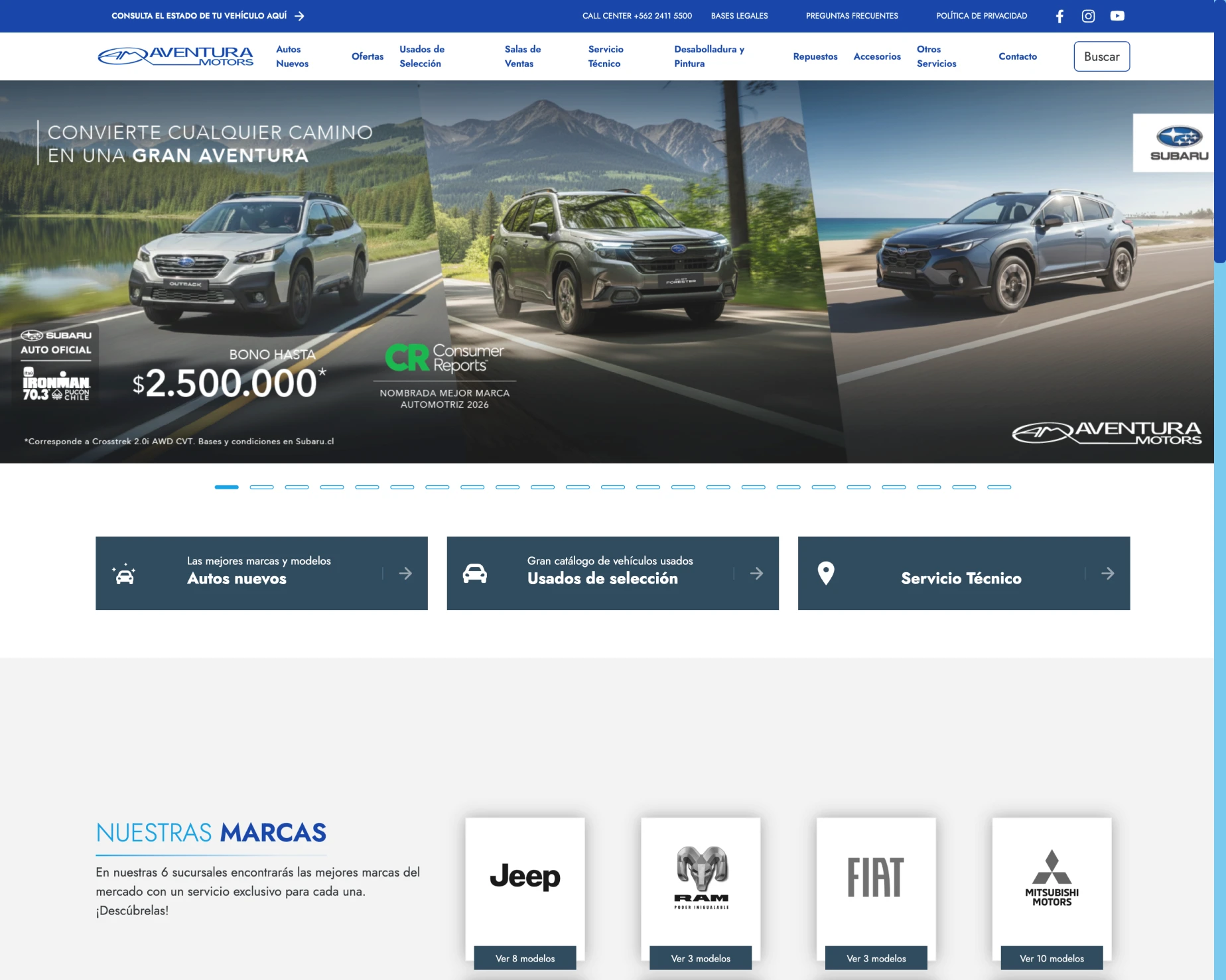
The website was originally designed as a funnel redirecting users to sales reps via WhatsApp, which severely delayed customer service."

  • Critical Score: 1.9/5.0 in the local benchmark (the lowest in the market, compared to Derco at 3.4 and Bruno Fritsch at 3.2).
  • UX Failure: The site failed simultaneously at a major financial decision (buying a vehicle) and at fast service management (booking maintenance).
  • Crisis of Trust: It hid information, fragmented the brands, and forced users to resolve everything via WhatsApp instead of enabling digital autonomy.
2. Definition: Two Users, One Central Tension

The design had to solve the needs of two opposite profiles without sacrificing the experience of either:

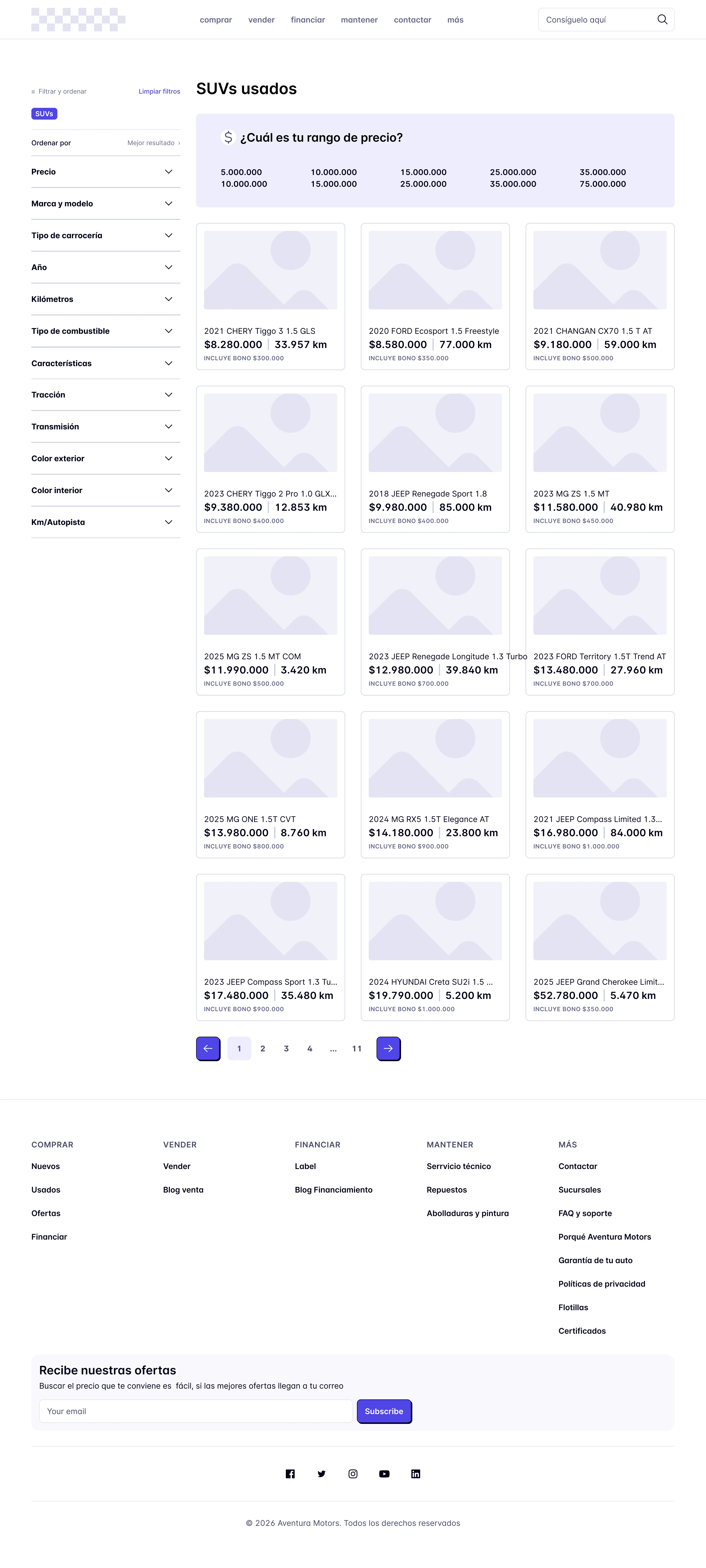
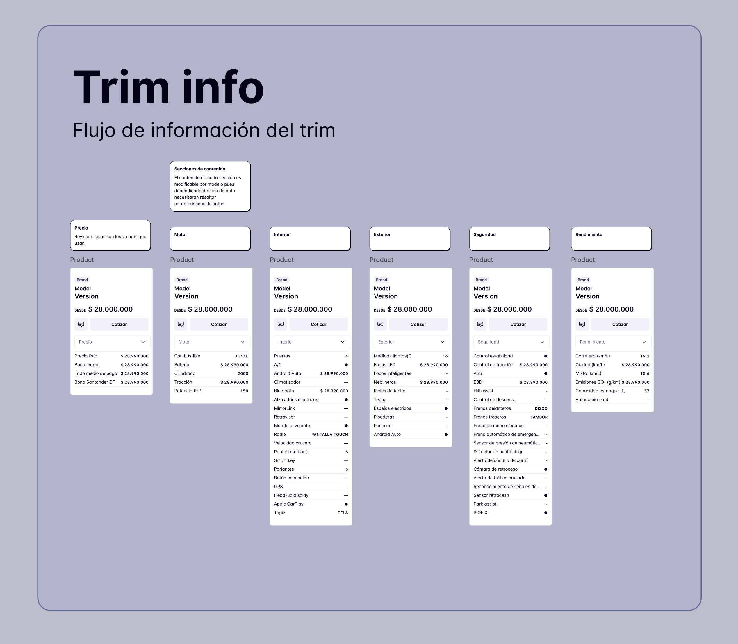
  • The Buyer (Ages 35–55): Researches new or used SUVs. Requires high trust, extensive photography, transparent pricing without 'fine print', clear specifications, and institutional validation.
  • The Existing Customer (Ages 25–65): Needs to book a service from their mobile device in under 3 minutes. They aren't looking for inspiration; they demand an ultra-fast, direct, and frictionless transactional flow.
Results and Takeaways
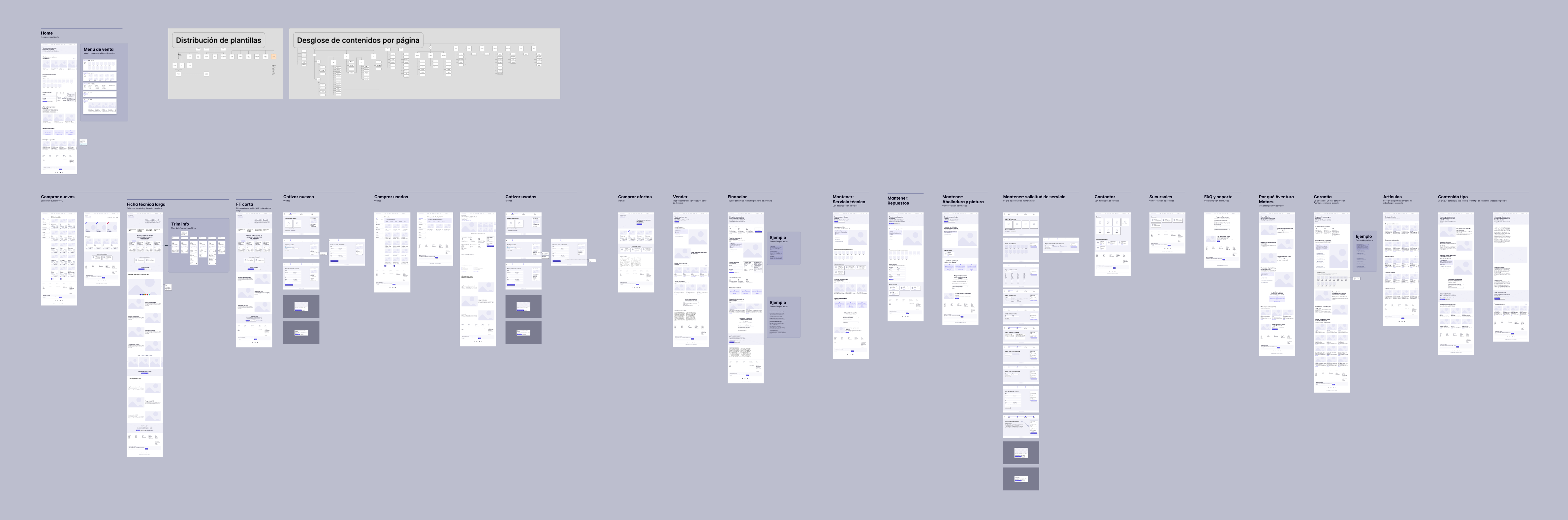
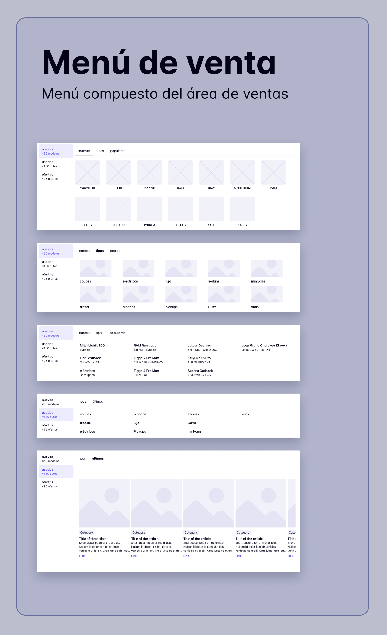
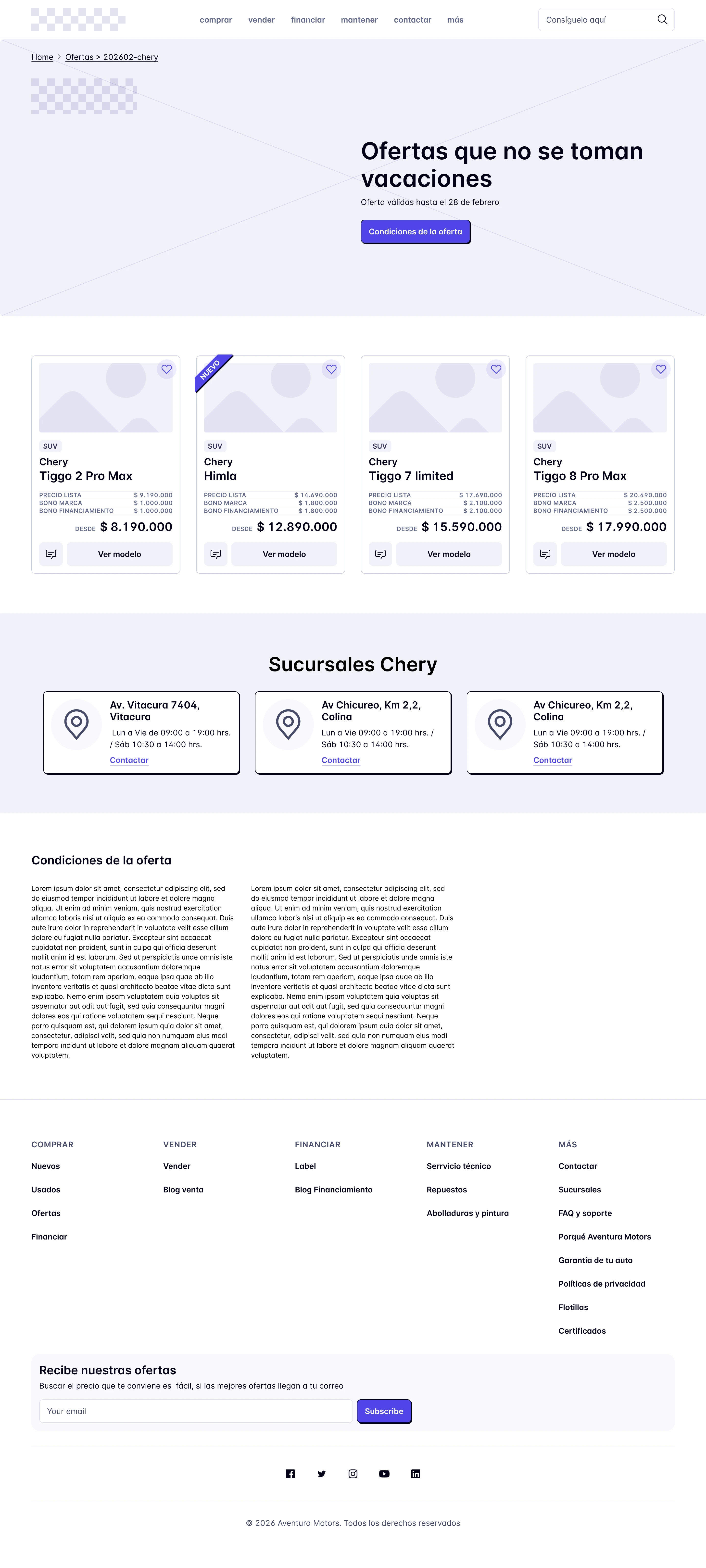
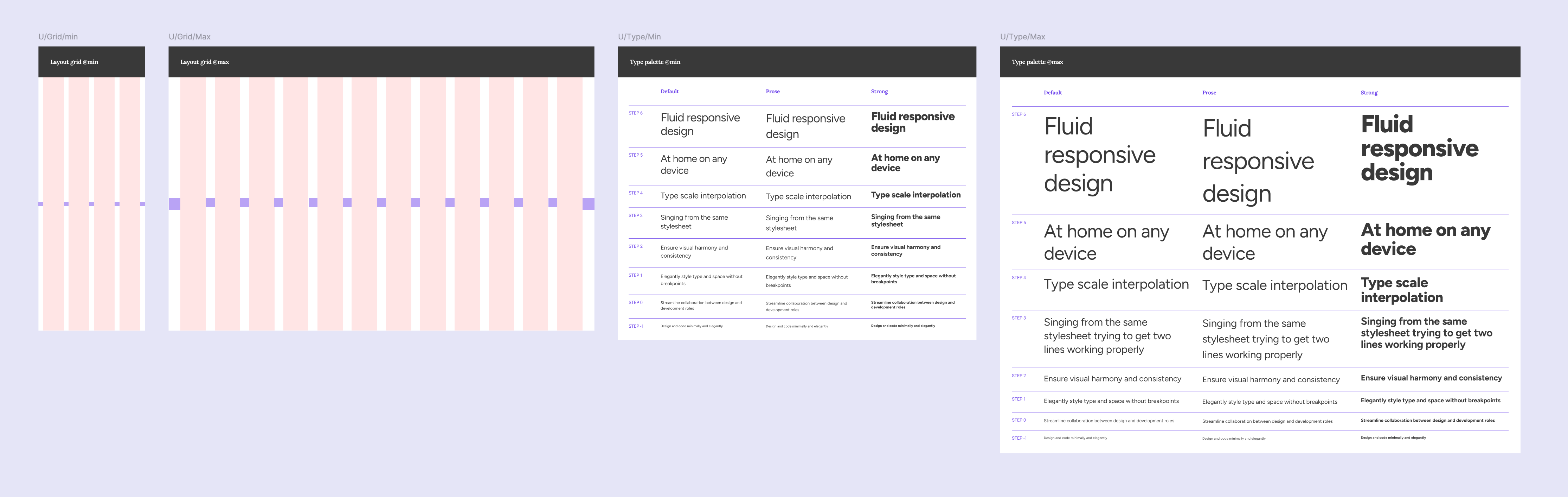
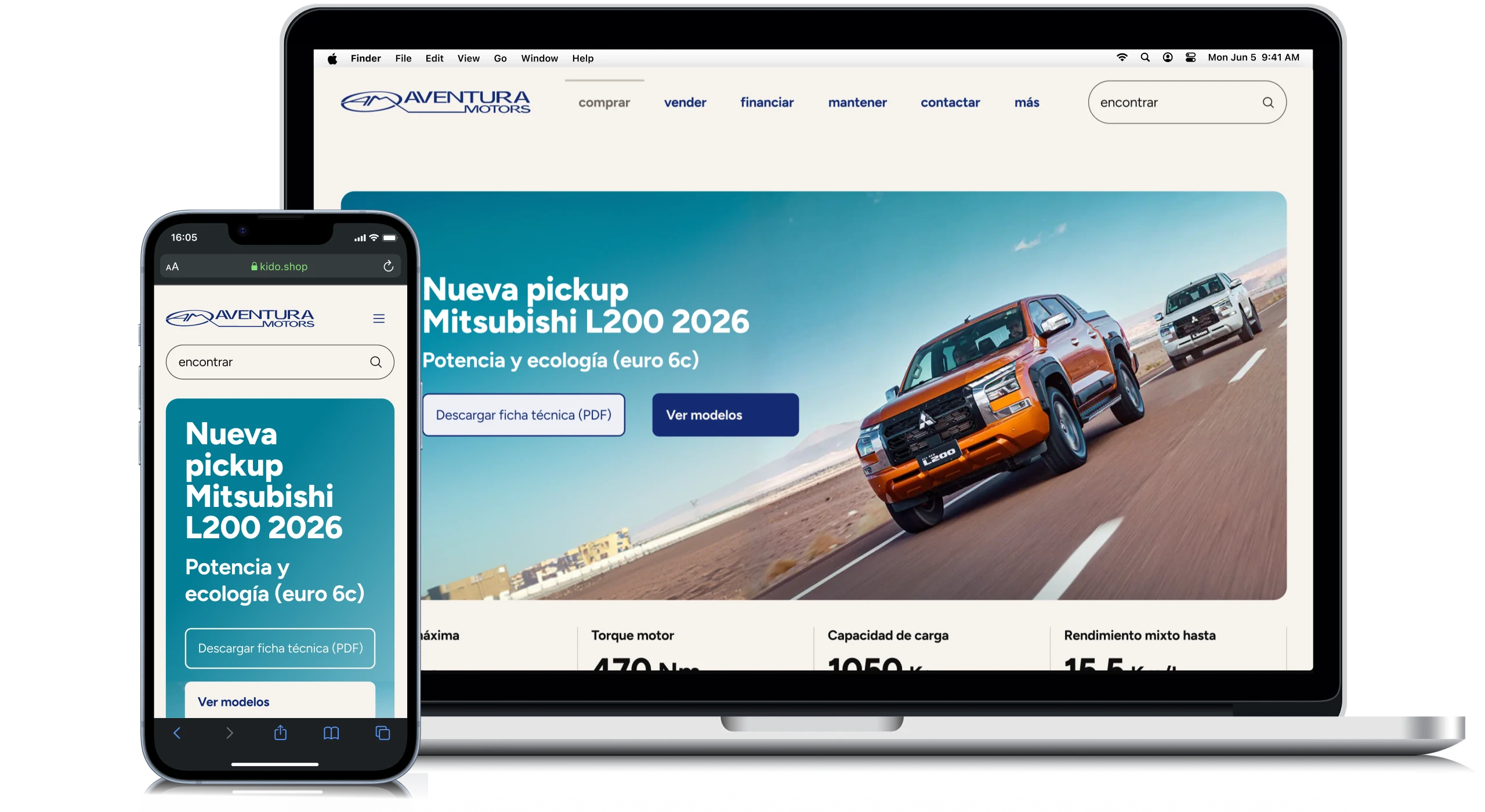
  • Scalable Infrastructure: Delivered a modular component system designed to withstand catalog changes, new brand additions, and promotional campaigns for the next 3 to 5 years without breaking.
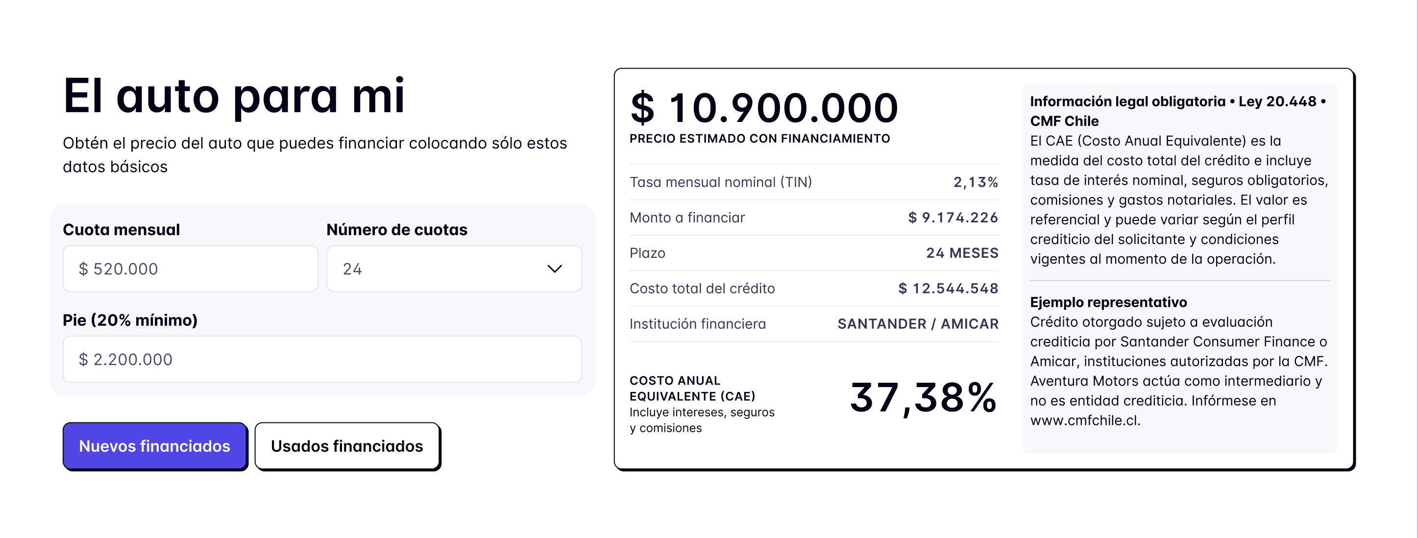
  • Design with Purpose: Designing for both $30 million and $30,000 price points on the same site isn't solved by prioritizing one flow over another, but by accepting the tension and creating an architecture that allows both to coexist.
  • Neutrality Requires Rigor: Creating a 'neutral container' that steps back to elevate the manufacturer's brand demands much stricter design control than building a traditionally flashy website.
  • Long-Term Risk Mitigation: Accessibility issues, visual inflation from competing brands, and promotional clutter are resolved at the component stage, not during the final hand-off.